Select a learned lesson:
Encouraging answers from stakeholders and clients
Transparent and Sustainable Design
Team health: Evolving a mental model
Quick Hits of Experience
Team health: Evolving a mental model
The Context
Communication is the make or break for any project. When I joined this Center for Medicare and Medicaid Services (CMS) project as a Lead Human Experience Designer, I was surrounded by some of the most talented developers, passionate analysts, an eager designer, and intelligent subject-matter-experts/stakeholders… and a completely broken down system of communication.
How did this manifest? It meant we had a team working at completely unsustainable rates to deliver product features of varying importance that would address platform problems either only partially or not at all. There was almost an air of distrust as no one knew the contributions needed from one another to solve any of these problems.
The lesson, in a sentence (or three)
When a process "works," the habits it forms can cause a blindness to its weaknesses. Fresh eyes, persistence, and open communication can evolve any process into a better version of itself. Team experience is product experience.
Some skills explored in this lesson
Finding the Root
A problem can only be solved when it is properly understood. This was not a matter of incompetence; so where was the origin of this friction? After a few open conversations with some team-members, I realized that nearly every person had been a part of this project since the beginning. This was a project that had been running for a few years at this point, and the wind I had caught about its early successes only confused me more. There were variables, but they were nearly constant; what was I missing?
I was speaking with one of our program managers when it finally clicked. When I had asked about the early stages of the project, they were recounting how quick it all moved at the start. "Not unlike a startup, maybe a little quicker..." Suddenly it all made sense. The couple sprints worth of work I was involved in were packed with shortened deadlines. I attributed this toward a nearing launch date for a new feature. I checked JIRA, jumping from sprint to sprint into the past. Sure enough: This cadence was no anomaly. We weren't a bad team, we were a tired one, and perhaps too proud to notice that everyone was redlining to finish features quick rather than finishing them well.
Where to Begin
Revolution in this space could not begin with cries for change. No one was setting this pace maliciously; many did not even realize they were working themselves so unsustainably. I certainly wasn't going to run into the next stakeholder meeting and demand everything change. 'Ignorance' as a term is often recollected infamously; deliberate structure to ignore important factors and consequences. I wasn't witnessing that.
What I was witnessing here were developers, analysts, and leadership that were working this pace as a point of habit: "We are capable, so we shall." For our designer, who professionally never saw another project, it was a set expectation: "This is simply what this job entails anywhere and in any project." For our clients, it all felt like status quo: "They are delivering almost quicker than we can ask, so we can ask for more." (Not to downplay the increased load on them, too, as our subject matter experts and requirements sharers!)
With no one truly to "blame," my hypothesis set in. If no one believes anything's wrong, you can't suddenly steer them away from the crash they don't see. What you can do is let everyone know how hard everyone else is working. A team this passionate is far more likely to empathize with the weight their teammate is carrying before worrying about what's on their back.
With everyone's plate already full, I very well couldn't demand time from everyone to share a Ted Talk from the perspective of every team role and the effort involved. And with that came the crawling (and what I would later label as effective) process of...
Passive Education
The best place to start would be to utilize time the team already has with one another and with stakeholders. User experience as a craft is already a bridge from stakeholders, to developers/product supporters, to users; if I can highlight every step of that bridge and all the hands it passes through, maybe we can all re-recognize the effort and gravity at play.
Passive Education
Being the designer meant I would have something of a "captive" audience of team members and stakeholders on a regular basis as I present designs, concepts, and research. In the background, I would regularly chat with individual team mates to gain a better understanding of their processes.
Yes, a developer develops for example, but where do they start? What do they need to be successful? Is there something I can provide from a design perspective or something our analysts can provide from a business perspective to better smooth their work out? Are there any steps to your work that they believe slip under the radar?
I would work this information into my client presentations, usually as small adds that fit into the feature's story. "Here is a design that leverages this data pull or this complex interaction. Only made possible thanks to [developer], spending extra time with me to problem solve the most effective outcome."
Instead of merely pointing out a question with requirements, it's something like: "[Analyst] and I were going through those requirements you passed along. They spotted [conflict]. Their extra pass will really save us a headache."
This extends of course to our stakeholders as well. "We were spinning our wheels with this before [stakeholder] rescued us with their answer!"
Beyond conversation, I would also display my workflows that lead me to certain solutions. Often represented as sticky-note chains in FigJam or list of tasks next to a final design. I would use names as often as possible, mention tasks that others did outside of their usual responsibilities to go the extra mile, and really hammer home how grace and trust lead to our bigger breakthroughs.
And it really just sounds like my solution here is to communicate and you are exactly right!
Re-humanizing the work we all do so it's less like we're a machine that can be turned up to go faster and more like a passionate team that can be properly motivated and recognized for our strength and persistence (and be rewarded with grace, not simply more demand).
Results, in the End
I understand this is a rather non-traditional case study when one thinks of User Experience. Especially since its outcomes can be hard to properly measure in specific OKRs or objective metrics. But it is one I hold very closely to my heart.
In the end, it stayed contagious. As I would detail specific touches and tasks performed by other team mates, they would do the same. A project-community of mutually assured support and recognition then also builds more trust. A challenge to a stakeholder request feels less like a lack of confidence in them and more like a consideration for an angle that maybe hasn't been thought of yet. This bit of social grace naturally introduced more breathing room for every task.
It gave project managers room to thoroughly discuss and organize priorities with stakeholders. It gave analysts more time to make more careful considerations of requirements, and myself (and our other designer) more space to question them and visualize them as UI. It gave our developers and QA team space to challenge design work or ensure outputted functionality truly matched design's goals. Our stakeholders felt less of a need to yank the reigns to deliver as fast as humanly possible because our newly organized priorities (paired with our more refined problem-solving solutions) gave them ease that the work will come and will be effective.

It wasn't overnight, over-month, or even over-season; eventually we shed our "fight for survival or face immediate doom" startup skin and established our cadence as one of sure confidence and trust. As we're past MVP, the time for "product band-aids" delivered quickly fell into obscurity in favor of more methodical and planned efforts.
End. Thank you for reading.

*As is the case across my entire site, all content on this page did not utilize Gen AI in any step of its creation. These thoughts and reflections are entirely my own.
Encouraging answers from stakeholders and clients
The Context
UX design can never be an isolated task; in fact it leans in both directions on the product timeline.
To the left, UX depends on consistent and clear communication with analysts and stakeholders. A collaboration occurs when refining requirements, fleshing out early UI concepts, and identifying potential user friction. Clear answers require clear questions, so how can we promote clear communication?
To the right, UX depends on its relationship and confidence with developers and QA teams to bring concepts to accurate life. It is inevitable, and entirely understandable, that there will be some misalignment that occurs in UI behavior and styling. How can we mitigate this misalignment at the front and quickly squash the inevitable few that still make it through?
This learned experience is about the left.
(See Transparent and Sustainable Design for the right)
The lesson, in a sentence (or two)
Give clients and stakeholders every reason to take this as seriously and thoroughly as you do. Make them feel heard and they’ll talk out every answer.
Some skills explored in this lesson
Regarding the Left: Getting Answers from Stakeholders and Clients
Getting Started
Let’s dial in on the stakeholder experience. More often than not, there exists an entire working world for them outside of the time they share with our team during client calls. One must imagine a landslide of other meetings of varying importance, and one must imagine glazed over eyes despite best efforts.
First and foremost, UX's time with stakeholders must be engaging.
The easiest way I’ve found to achieve this is presence. In a remote meeting this means the camera is on, even in a Zoom room of grey tiles with white names across them. Having a single rectangle with your face in it makes you the center of attention while you talk; no wandering eyes leading to wandering minds. It means leading questions with the name of the person/people you want the answer from to avoid the constant “Sorry, would you mind repeating that, I’m multi-tasking.” Respect a conversation and it will naturally demand attention.
Visuals and Live Notes
Who doesn’t love something to look at besides a bunch of words on a screen? I hope you’ve enjoyed the images scattered around my site as something to lock onto when your eyes need reprieve. When in a meeting, funnily enough, these visuals can even be words on a screen.
One of the most successful skills I have developed as a UX designer is taking live notes in front of stakeholders (or on a shared screen if remote). This form of active listening benefits everyone involved. First, Stakeholders can see their own words being reflected back to them, encouraging them to more strongly consider their answers and also making them feel heard: “Here is a record of what you said, and proof that we hear you as we’ve typed it out ourselves.”
The strongest application of these ‘live notes’ are when they’re paired with design work/flow charts/any existing visual that requires feedback or holds questions for our stakeholder friends. Any time I present any of these types of documents, I will place them in some type of white boarding tool (ie FigJam, Miro, Mural) and utilize the sticky notes tool.
Color-coded sticky notes can be added before a meeting even occurs to highlight questions with priority, assumptions made during design, or clarification bits to offer clarity when reviewing. More stickies are then added during the call with the live notes/answers from stakeholders.
Everyone Wins
Aside from being treated to a visual feast of designs with their own thoughts layered on top, there are great benefits to be had using this live notes technique.
For me, the designer, I now have a document with direct quotes from our stakeholders giving feedback, answering questions, and asking questions of their own. Since they are attached to specific places in my work, I don’t even need to guess what they were referring to when reviewing the whiteboard again later.
The real killer advantage here though is how “package-able” this method is. How often has a meeting occurred when the right person to answer your question was unable to join? Or even more likely hearing, “Hmmm, I’ll have to take that back to the team and get back to you,” as a response. You can record this fact in the whiteboard, highlight it in a specific way, and export the entire thing as a PDF.
Now you have something that you can email to everyone involved in the meeting (or missing from it), and they can later peruse it without much loss of context. Questions are still pinned to specific places, and they can either carry their answers to the next meeting, or add comments to the PDF to send right back to you. Especially in remote work, asynchronous work is unavoidable, expected, and welcome. So offering an ability to allow stakeholders both room to think and context to pick it up at any time prevents future friction with ‘circle back’ wall of text emails or pinning them for answers before the meeting ends.
In The End
In the end, there is no grand secret to having more involved stakeholders and clients. My methodologies will always circle around active listening and rounding as many corners as possible to ensure safe delivery of answers to our questions. The secret is meeting stakeholders where they’re at and making them feel heard.
End. Thank you for reading.

*As is the case across my entire site, all content on this page did not utilize Gen AI in any step of its creation. These thoughts and reflections are entirely my own.
Building Fast Yet Sustainably
This lesson will be here very soon!
I obsess over my writing and am likely working on it right now. Please do come back for updates.
Transparent and Sustainable Design
The Context
UX design can never be an isolated task; in fact it leans in both directions on the product timeline.
To the left, UX depends on consistent and clear communication with analysts and stakeholders. A collaboration occurs when refining requirements, fleshing out early UI concepts, and identifying potential user friction. Clear answers require clear questions, so how can we promote clear communication?
To the right, UX depends on its relationship and confidence with developers and Quality Assurance (QA) teams to bring concepts to accurate life. It is inevitable, and entirely understandable, that there will be some misalignment that occurs in UI behavior and styling. How can we mitigate this misalignment and create fewer cycles of the iterative design process?
This learned experience is about the right.
The lesson, in a sentence (or three)
The designer isn’t the only designer. Rely on developers and QA (in addition to other team members) to fill the blanks in your perspective; do it early. And cut them some slack, yeah?
Skills explored in this lesson
Regarding the Right: Transparent and Sustainable Design
In Their Shoes: Developers
Much like the previous lesson about stakeholders, it starts first with putting yourself in the shoes of our technical teammates. As I understand it, developers I’ve worked with will often look at the problems UX attempts to solve with an almost brutalist perspective. What purpose does this component serve, what technical debt does this idea take on, what is the most effective path to building these schematics before me?
Before answering this, we must first look to our friends in QA.
In Their Shoes: Quality Assurance
QA teams are the unsung heroes that can save you from walking right off that cliff while you were too busy looking at the horizon past it. They are your “worst” and best users that bump into every piece of furniture to ensure none of the corners are too sharp for actual users. Does this look right, is this supposed to be what happens, what about when I try this?
Both developers and QA probably can do what they do alone, but they don’t have to. A key role as a UX designer is facilitating their workflow, answering all of their questions with efficiency and accuracy.
Designing Design Systems
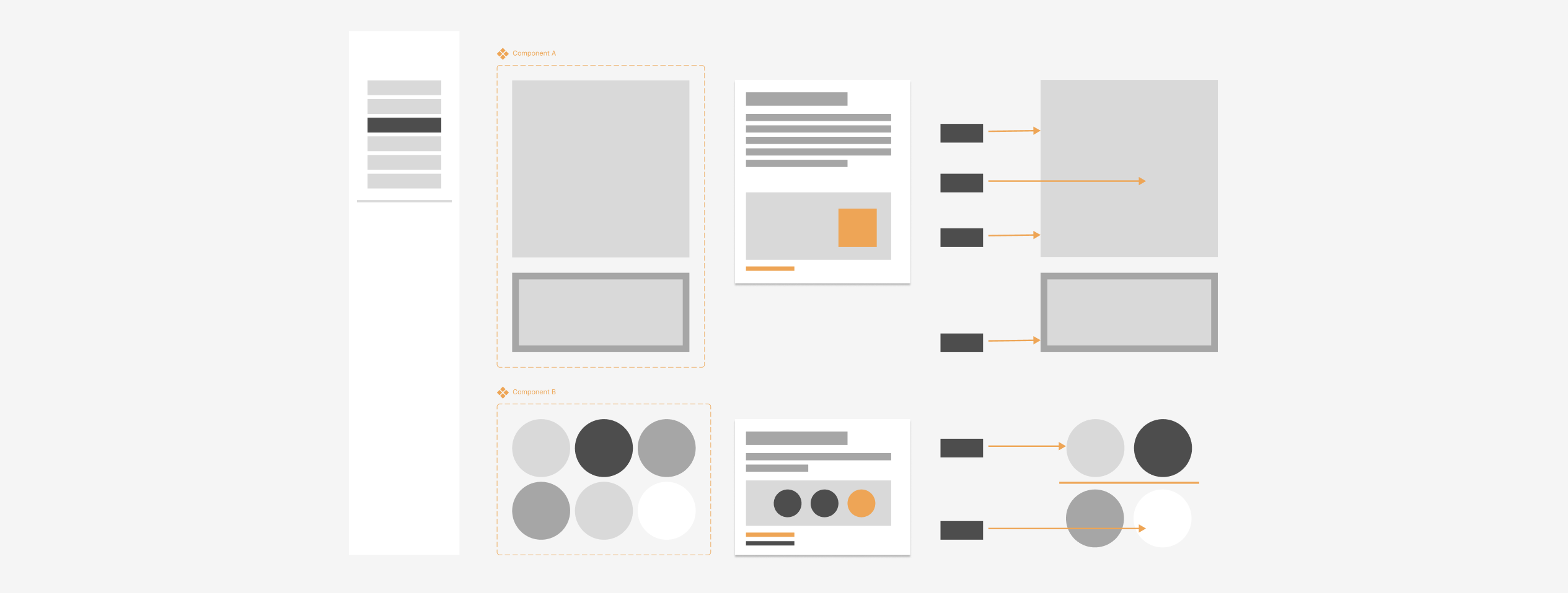
In the easiest place to start, I try to address both developers and QA through my design system. In a few points, this can look like:
‣ Clear delineation between in-progress and up-to-date work.
‣ A file structure mirroring that of an instruction booklet rather than a showcase.
‣ Labeling colors, measurements, and animations; using a "language" they can easily understand, leaving none of it up to assumption.
Beyond creating this space, I also talk through it. I will walk through new components (and their behaviors), adjustments to file structures, etc. with developers and QA. The file itself should be plenty to guide them, though the additional conversations up front can also help solidify desired behavior, highlight potential flaws, and help reinforce the idea that it is a living document that can flex as needed.
That last part is particularly important. To non-designer members of a team, UX work can feel like a 1000-foot mesa with no points of egress. It is my hope that open communication about updates to files such as design systems invite the idea that feedback is welcome and encouraged. There is always opportunity for any designer to be wrong, and I am not exempt from this idea. An open dialogue regarding design work is key to using several perspectives to build the most effective components for UI design. This ideology goes beyond just design systems; more on that in a bit.
Speak Their Language
I want to highlight one of my prior points regarding design system design: “Labeling colors, measurements, and animations in their language, leaving none of it up to assumption.”
The UX-to-development connection is a lucky one in that there is often cross-over in the ways we both describe the things we’re creating and seeing. We both understand concepts like pixel measurements, flex and responsiveness, and color hexes. This must be leveraged to help smooth the transition between a designed screen and a developed product, and this starts with strong labeling.
Design tools like Figma have improved where features like Dev Mode can help a developer navigate designs and understand spacing, styling, and behavior. While these options are definitely great, especially for asynchronous hand-offs, they lack a specific “at-a-glance” approach to transferring UI work to the build stage.
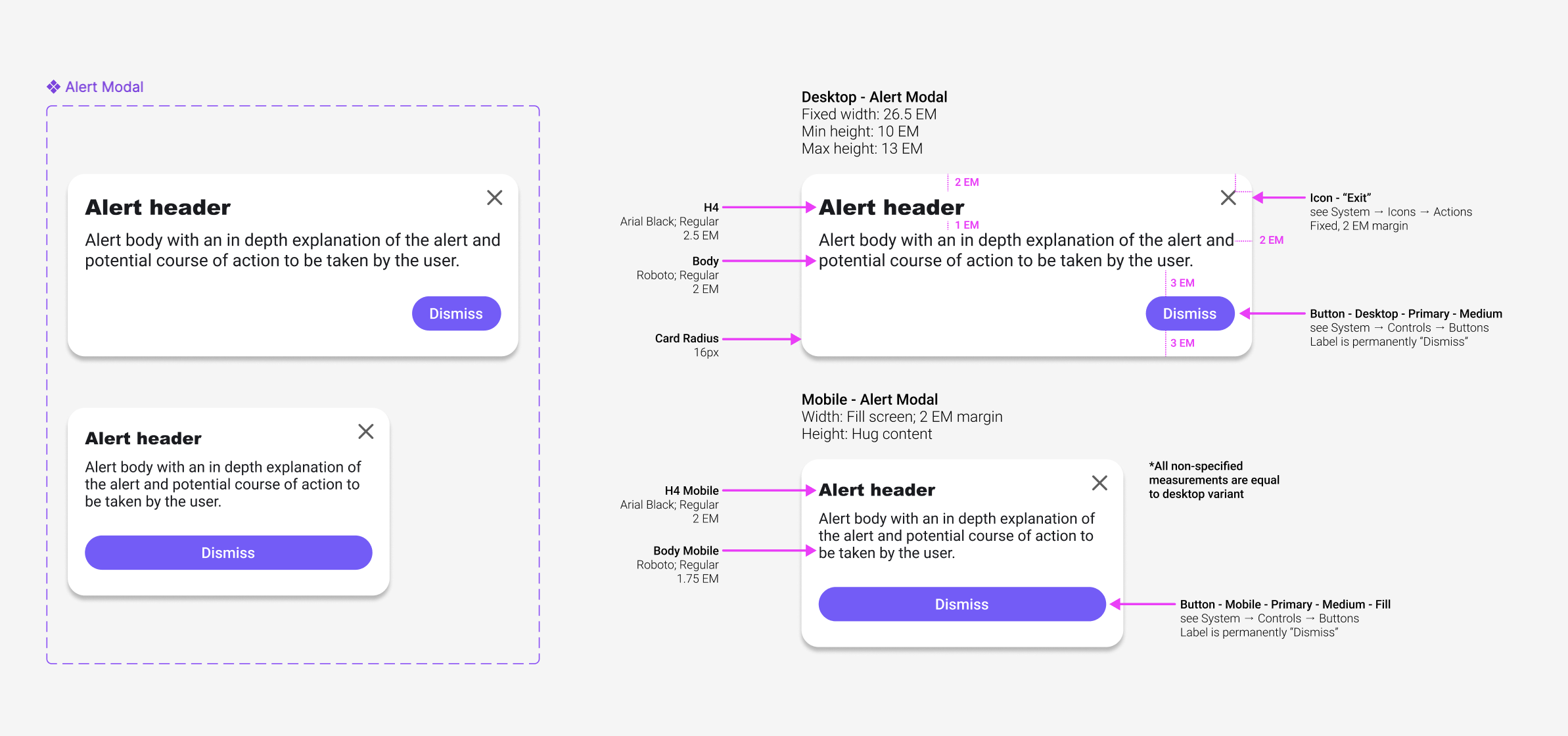
In offering full component breakdowns, with references and links to allow the extra curious to get even further in the weeds, I fully empower developers to double-check their work against mine. For QA folks, or other team members that may not have access to tools like Figma’s Dev Mode, it’s an opportunity for them to be able to more deeply understand and ‘test’ the developed product as well.
The greatest outcome from this approach is the space it gives everyone to breathe. As a designer, I can loosen my grip on my work, and more easily trust developers and QA to mirror what I’ve designed as they translate it into code. For developers and QA, it means less rework. When the ambiguity is stripped, and less guesses can be made, there are fewer bug tickets made for UI that is misaligned with the original vision.
Get EVERYONE in EARLY
When joining many different projects, one thing mentioned by every single team, regarding their relationship with design, is the disconnect they feel from the design process itself. Oftentimes it’s a disheartening mention that they can offer no perspective on the final outcome for how the product looks and acts.
Earlier I mentioned an open dialogue for creating a design system, and alluded to how that approach goes beyond just design systems; it does, and the conversation also goes beyond just developers.
The best thing I can do for a product is include not just the perspective of the user or stakeholders, but to also include the perspective of my entire team.
Just like how I present early concepts to stakeholders and clients, the same is done even earlier with the internal team. I am very confident in the work I develop, and the addition of their views and opinions only allow for that work to become stronger and for me to be even more confident. UX is there to put the perspective of users and stakeholders forward. Developers are there to ensure my concepts are grounded and possible to achieve. QA and project analysts are the detail members to make sure every requirement is accounted for and every user path is considered.
In The End
Work up front will prevent harder work down the line, which is why I do what I can to include as much of the team as possible in the design process; part of inclusion is ease of access and translation into a language non-designers can understand. In the end, I end up with a product that has considered more angles, potential pitfalls, and edge cases.
End. Thank you for reading.

*As is the case across my entire site, all content on this page did not utilize Gen AI in any step of its creation. These thoughts and reflections are entirely my own.
Quick Hits of Experience
This lesson will be here very soon!
I obsess over my writing and am likely working on it right now. Please do come back for updates.